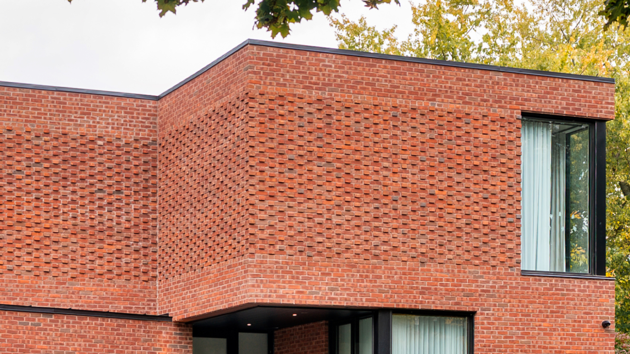
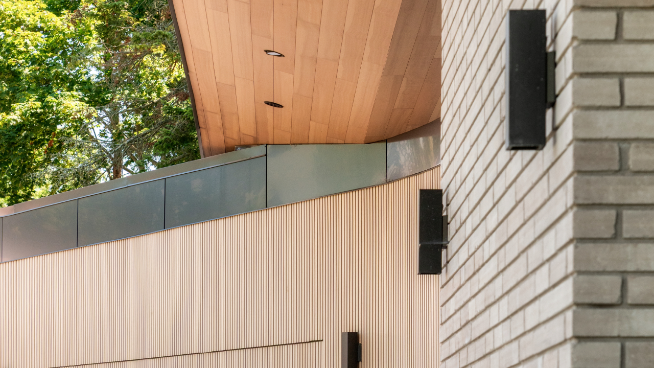
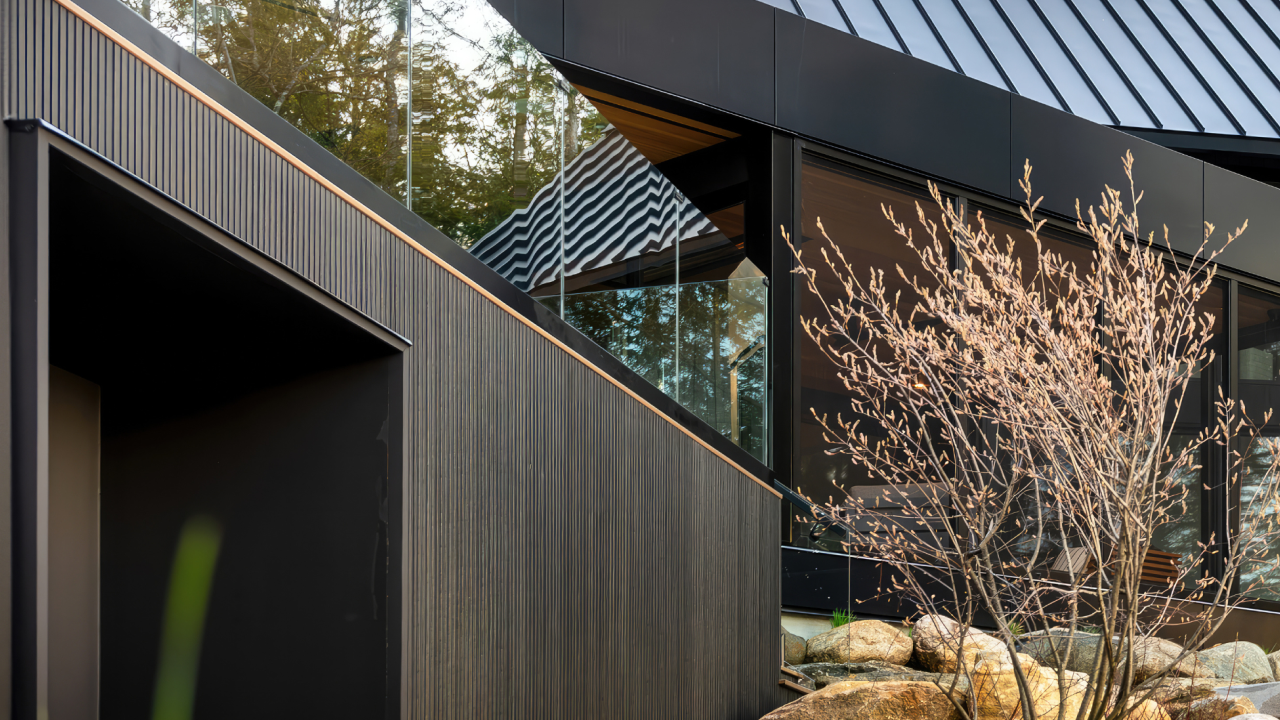
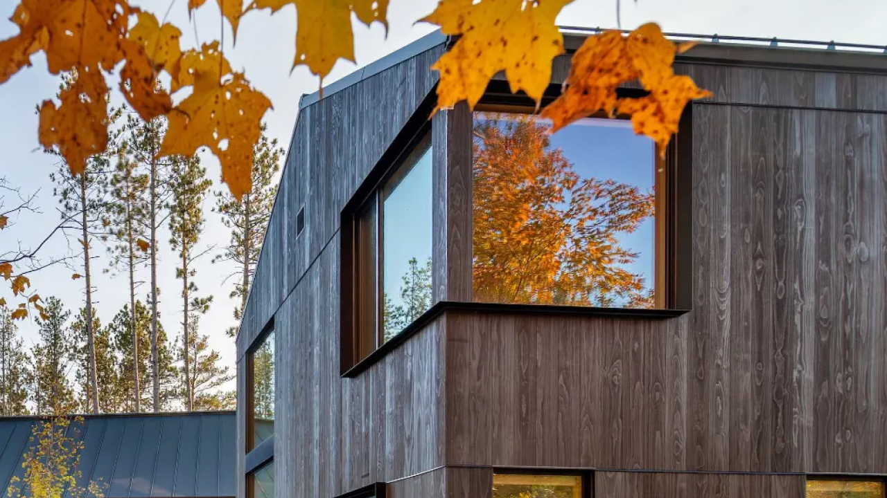
01 — Brand Direction
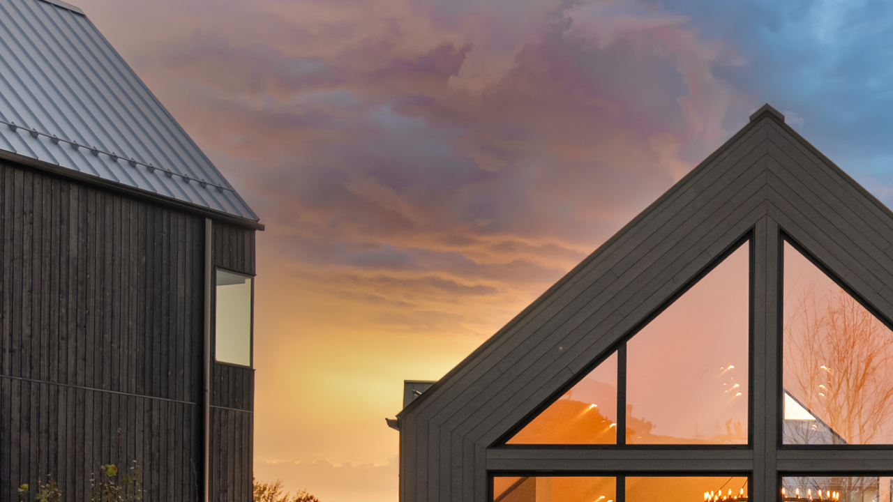
A refined visual direction for SMPL Design Studio — elevating the digital presence to match the calibre of the work. Photography leads. Brand recedes. The home commands.
We believe a home is not a product — it is a singular act of intention. Every decision refined until nothing remains to be removed.
This document presents a refined visual direction for SMPL Design Studio. The photography leads. The brand recedes. Every typographic choice, every spacing decision, every colour exists to frame the work — not compete with it.
Quiet confidence. Material honesty. Spaces that breathe. The photography is the artwork — the website is the frame.
Inter carries the interface with precision. Newsreader brings warmth and editorial weight to headlines and project names.
Rational, refined. Set light (300) with generous letter-spacing. The voice of precision — it disappears into the layout so the photography can speak.
Optical, expressive, and warm. A contemporary serif with historical depth. Light weight only. The voice of authority — set generously at large sizes.
Warm, muted, and grounded — a palette that never competes with the photography.
Bone and Warm Cream form the canvas — light, unhurried, paper-like. Soft Stone bridges the neutrals. Deep Charcoal grounds everything with quiet authority.
Moss Olive and Terracotta are deployed sparingly — typographic accents, hover states, border details. They echo the landscape materials in SMPL's work: cedar, limestone, oxidised steel.
The digital surface should echo the physical one. Matte, warm, and tactile — never glossy.
Matte finishes only. Light should rest on the interface, not bounce from it.
Grain as atmosphere — barely visible, felt more than seen.
Rules whispered, not spoken. 1px at 8% opacity. Structure without noise.
Soft and warm. Shadows locate — they don't dramatise.
Every component should feel considered. Rounded where appropriate, direct where needed — never clinical.
No sticky. Frosted glass background on scroll. Wordmark in Inter 300, 0.3em tracking. CTA as a pill — the one direct call to action.
Pill shape for primary/secondary. Underline-ghost for inline links. All uppercase 10.5px, 0.16em tracking.
Before a single line is drawn, we invest time understanding the rhythms of your daily life — the way light moves through your mornings, the spaces you gravitate toward.


Rounded cards (22px) with frosted info panel. 16px gap. Image scales 1.04× on hover at 0.9s cubic ease.
A proposed narrative arc — guiding a prospective client from immediate emotional impact through informed confidence and a clear next step.
Full-viewport photography or slow-motion video. Minimal wordmark. Single evocative headline. Emotional impact before information.
Full viewport3–4 signature works in a full-width editorial grid. Photography leads — type recedes. Name, location, year. Each card links to a project page.
Full width gridOne confident, well-crafted paragraph. Speaks like a person, not a brand. Positions SMPL without overselling.
2-col layoutTypographic list: Planning · Residential Architecture · Interior Design. One phrase per service. No icon grids — architecture doesn't need them.
Typography-led2–3 recent articles or project features. Editorial image, title, date. Connects the studio to a point of view on residential design culture.
Card rowFull-width close with a single CTA. Dark background or cinematic image. Location, contact, social. No form on homepage — quality over volume.
Full width darkInter Light, 0.32em tracking. SMPL alone for primary use; SMPL Design Studio for formal contexts. Never heavy weight, never tight tracking.

SMPL Design Studio
A digital presence built to match the quality of the work. Let's bring this direction to life.